Band posters, you know, those 11 x 17 pieces of paper you see hanging up in bars and clubs telling you when your favorite band is going to be performing. Well, there's a lot that goes into a well designed poster or flyer. So, what goes into a good poster? Well first, for me anyway with the example featured here was to select an image.
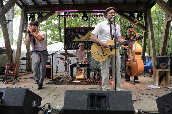
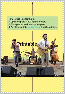
 That's looking better. Now it's time to drag the image into Photoshop and start adding text. Note, always make sure to pay attention to the printers templates! Here's what the photo looked like after being placed in the template.
Okay, now what? Next I modify the photo to have a more "graphic" appearance. The reason for that is that I'm trying to capture the feel of an old concert poster from the 50's. By using some great filters by Mister Retro it's pretty easy. I used their "Permanent Press" filter to modify the photo. Here's what it looks like before and after.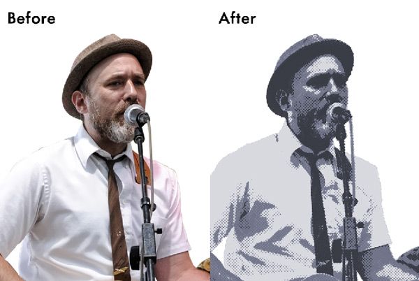
As you can see, the filter adds a nice analog feel. Now it has a much more "poster" like feel to it. Next we start slapping some text on the poster. For this poster I wanted to use an authentic vintage font. I chose to use "Killroy" from Walden Font Company. This font came from their WWII poster fonts collection.
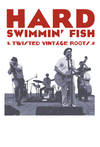
So, as you can see, it's starting to look like a poster, but it has a long way to go. Next I'll add a nice old paper background.
Okay, that's looking a little better, but it's still missing something. So, next I'll add some horizontal stripes to help break up the space a little.
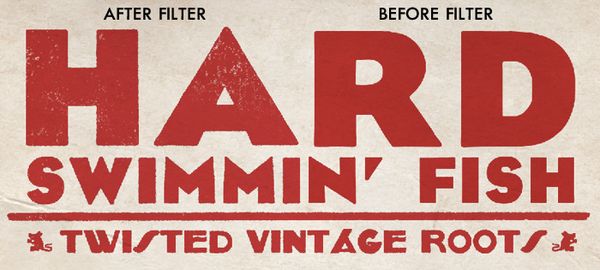
Getting there. Text still looks a little clean for my taste. To fix this I use Mister Retro's "Spot Wash - Dirt" filter and Mister Retro's Permanent Press. They just add a little grunge and help make things look a little less "computerized" Here is a close up of the text before and after. Unfortunately I have the after on the left this time (oops).
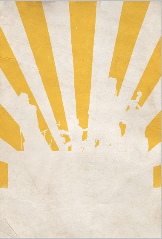
Now we're getting pretty close to being finished. But we still need something else to add a little visual interest to the piece. I chose to add some vintage "rays" in the background. Here is what they look like isolated.
Note - When creating a vintage style poster, it's important to think about the little details (such as colors being printed out of registration, or not properly lined up). A lot of old offset printing will look a little out of alignment. Here's a close up to show you what I'm talking about.
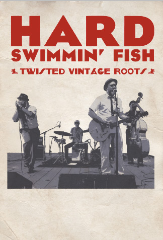
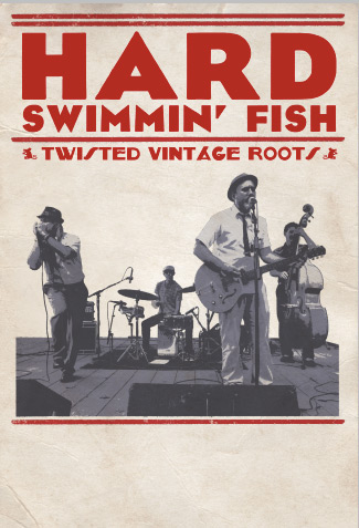
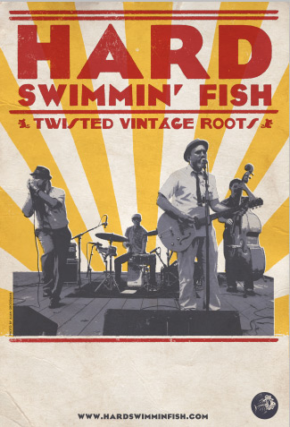
The final product looks like this.
I hope you enjoyed this Readers Digest version of poster design. There is a lot more to it, but this gives you the basic idea of how to create an old style poster with new fangled technology. Make sure to check out Mister Retro and Walden Font Company. If you would like to see more vintage style (and actual vintage) posters, head over to the grand daddy of poster printers Hatch Show Print.

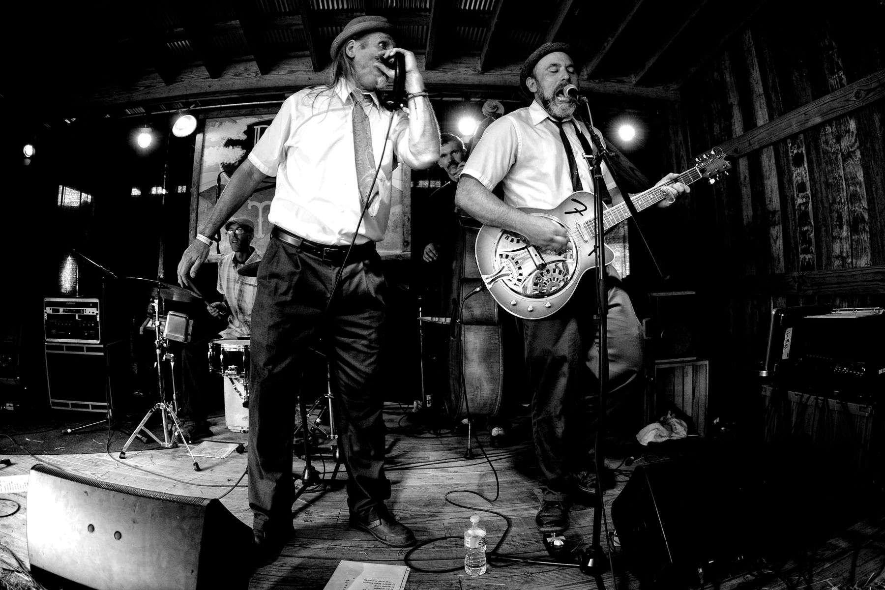
Original Image for poster
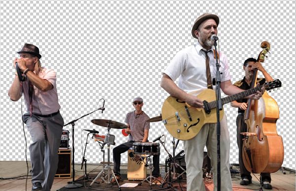
Okay, so we have our photo (thanks Alan Grossman!). It's a great photo, but do to the fact that it's outside, there is a lot going on in the background. Next step is to remove all the background.


Okay, now what? Next I modify the photo to have a more "graphic" appearance. The reason for that is that I'm trying to capture the feel of an old concert poster from the 50's. By using some great filters by Mister Retro it's pretty easy. I used their "Permanent Press" filter to modify the photo. Here's what it looks like before and after.

As you can see, the filter adds a nice analog feel. Now it has a much more "poster" like feel to it. Next we start slapping some text on the poster. For this poster I wanted to use an authentic vintage font. I chose to use "Killroy" from Walden Font Company. This font came from their WWII poster fonts collection.

So, as you can see, it's starting to look like a poster, but it has a long way to go. Next I'll add a nice old paper background.

Okay, that's looking a little better, but it's still missing something. So, next I'll add some horizontal stripes to help break up the space a little.

Getting there. Text still looks a little clean for my taste. To fix this I use Mister Retro's "Spot Wash - Dirt" filter and Mister Retro's Permanent Press. They just add a little grunge and help make things look a little less "computerized" Here is a close up of the text before and after. Unfortunately I have the after on the left this time (oops).

Now we're getting pretty close to being finished. But we still need something else to add a little visual interest to the piece. I chose to add some vintage "rays" in the background. Here is what they look like isolated.

Note - When creating a vintage style poster, it's important to think about the little details (such as colors being printed out of registration, or not properly lined up). A lot of old offset printing will look a little out of alignment. Here's a close up to show you what I'm talking about.

The final product looks like this.

I hope you enjoyed this Readers Digest version of poster design. There is a lot more to it, but this gives you the basic idea of how to create an old style poster with new fangled technology. Make sure to check out Mister Retro and Walden Font Company. If you would like to see more vintage style (and actual vintage) posters, head over to the grand daddy of poster printers Hatch Show Print.